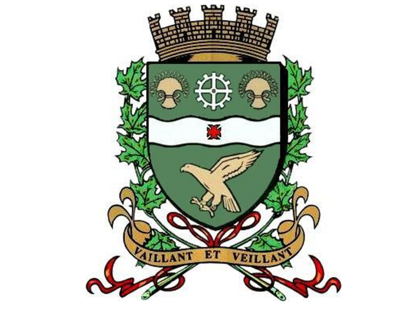
The Town of Hawkesbury's Coat of Arms
In 1959, the Town Council adopted a new coat of arms for the Town of Hawkesbury, designed in 1957 by the Canadian College of Coat of Arms. The new coat of arms retains elements of the Town's old seal while respecting the laws of heraldry, and also incorporating historical symbols.
Among the symbols retained, the wheel represents industry and work. The colour green, symbolizing forests, represents the timber industry that brought prosperity to the Town. The “fess”, with a “cross pattée”, comes from the coat of arms of the Jenkinson family, in memory of the first Baron of Hawkesbury and Dr. David Pattee. The wheat sheaf, the emblem of agriculture, also appears in the new coat of arms.
The hawk is used to identify the Town. The motto “Vaillant et Veillant” recalls the development that was done through hard work, and alludes to the hawk's bravery and vigilance.
The citizens of Hawkesbury are proud of their coat of arms, which is representative of their history.


It is important to control the use of the Town of Hawkesbury's visual identity. All branding establishes consistency to ensure optimal logo recognition. It is crucial to remain faithful and consistent in the use of a visual identity to avoid creating confusion among the population. When an institution chooses to follow a visual guide, it becomes easy to spot errors in use by outside agents.
According to the 2024 communications policy, the Town of Hawkesbury's visual identity may only be used in specific contexts and for well-defined reasons, in agreement with the approval of the Town's communications department. It is therefore forbidden to use the logo without the department's approval. It is also important to note that any organization using the logo must do so in accordance with the defined visual identity.
The Town of Hawkesbury Logo
The Town of Hawkesbury's 150th anniversary celebrations, held on November 19, 2008, provided the perfect opportunity to modernize its corporate image. The new logo includes a number of special features:
- The two colours of the logo, blue (Pantone PMS 540 / CMYK: 100/49/0/70) and green (Pantone PMS 7491 / CMYK: 35/0/85/35), represent water and earth.
- The dynamic shape of the “H” illustrates growth and points to the future. It also represents a roadway, symbolizing the Town's progress. The green bars on either side represent the provinces of Ontario and Quebec, linked by the bridge. The “H” also symbolizes a building framed by two green stripes representing a growing town surrounded by a rural environment. These stripes also represent the support the Town wishes to offer its citizens. The “H” alone represents all the roads leading to Hawkesbury.
- The simple typography is attractive and easily identifiable. The reflection represents the water of the Ottawa River and the Town's radiance.
The Town's new corporate image is an important tool for promoting the Town beyond its borders. Please refer to Communications Department for the use of the Town's coat of arms, logo and signature.

